Avatar
Updated
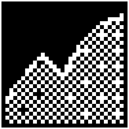
Avatar is a square portrait in a 2px ink frame, in three sizes. Without a photo, or while one loads, it shows the person's initials in pixel caps. AvatarGroup overlaps a row of them and ends in a +N tile past max. Like the charts, it takes your theme's ink and paper, light or dark, and needs no Tailwind.
Example
+2
import "@/components/dithercharts/controls.css"
import { Avatar, AvatarGroup } from "@/components/dithercharts/avatar"

<Avatar name="Ada Lovelace" src="/ada.jpg" size="lg" />

// Avatars take the group's size; past max the rest become one +N tile.
<AvatarGroup max={4} size="md">
  {team.map((person) => (
    <Avatar key={person.id} name={person.name} src={person.photo} />
  ))}
</AvatarGroup>
Install
Controls install with DitherCharts Pro. See Installation to log in, then import controls.css once, e.g. in your root layout.
npx dithercharts add avatar
Props
It renders a native element, so every other attribute that element takes passes through.
| Prop | Type | Default | Description |
|---|---|---|---|
| namerequired | Type string | Default – | The person's name: the avatar's accessible name, and where the initials come from. |
| src | Type string | Default – | A photo. The initials show while it loads, or if it fails. |
| size | Type "sm" | "md" | "lg" | Default – | 24, 32 or 48px. Inside an AvatarGroup it defaults to the group's size; otherwise "md". |